6 Principles

There are six principles of user interface design. I explored some amazing samples for the principles and I would like to share with everyone.

1. Structure Principle

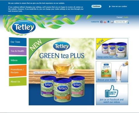
The following is the Tetley Company’s website. The structure of this website is very organize. The navigation is align to the left with a unify shape. The sales event contents are organized purposefully together.

Image

2.Simplicity Principle

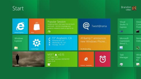
The Windows 8’s interface is successfully presented the principle of simplicity. It has may application buttons with extreme simple design as color rectangles. Users can just click on the buttons to explore more about the applications.

Image


3.Visibility Principle

The Avast’s user menu is a great example of visibility principle. It does not have too much graphics that would distract users. Every button is made for some functions and the information is clear and easy understanding.

visibility-principle


4.Feedback Principle

One good example of the Feedback principle would be the well known social media site, FACEBOOK!

Facebook has an easy access log in page. Whenever the user has difficulty to log on it will have a pop up message to guide users.

feedback1


5.Tolerance Principle

Google the search interface is a excellent example for the tolerance principle. When users are using Google to search something, it would come up with some recommend search options which makes searching easier.

screen-shot-2012-02-24-at-3-25-50-pm1


6. Reuse Principle

The following is the site of  Pinterest, it is a site that lets user upload and share pictures. The overall interface is simple white frames on every uploaded pictures from users. It makes the pictures stand out and users can have a preview before enlarging the pictures. This site is also easy to access, users just need to click on the pictures that interest them, they do not have to over think on it.
 

Pinterest


Portfolio Analyse

I would like to share some of my works and how I developed them.

The first one is the Ontario Spa poster, I designed it for advertising spa industry of the Ontario Tourism. I illustrated a women having comfortable moment of doing spa. The overall style is classic and vintage. I used stroke on the title text to emphasize it. Also the illustrations of bamboos in the background creates a natural atmosphere.

Image

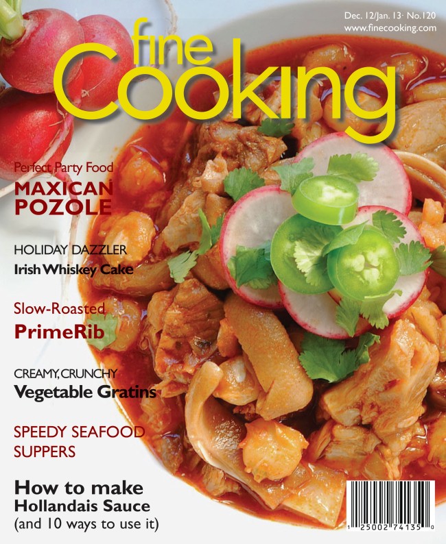
The second piece of work I would like to share is the magazine cover I redesigned for the Fine Cooking. The feature story in this edition was Maxican Pozole, so I used a photo of delicious pozole in the background. The title is placed on top with bright yellow color and drop shadow effect to stand out on the cover. All the other subtitles are align to the left regarding to the consistency of display. Image


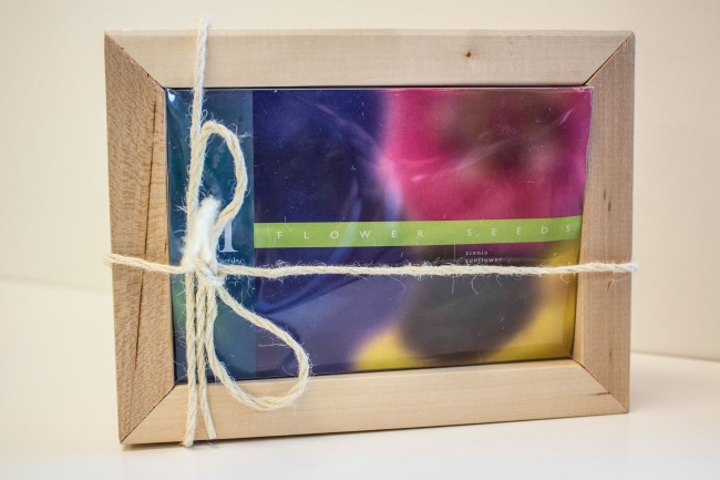
The last work I would like to share is the package design for the seed company Mckenzie. The package design was generated in illustrator, as well as the logo. The container was a wooden box with six slots. The inside was cotton bags to carry seeds and had tags dangle on the strings which has detail info about the product. Front cover was a clear plastic lib with a transparency cover image.

Image


Career Plan

I’m expecting to find a job in an advertising company. I could work in different environment. For example, I would work in a studio for photography and working outdoor for directing an event and working indoor with computer for editing. I company that I would like to work with is the Dashboard, it is an agency which does brand engagement and they have many great clients such as  Toyota, LCBO and Vaseline. 

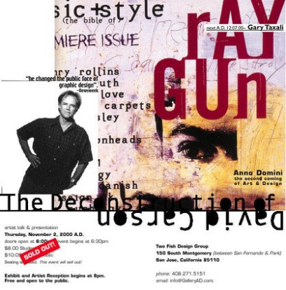
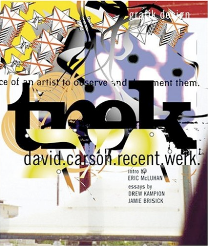
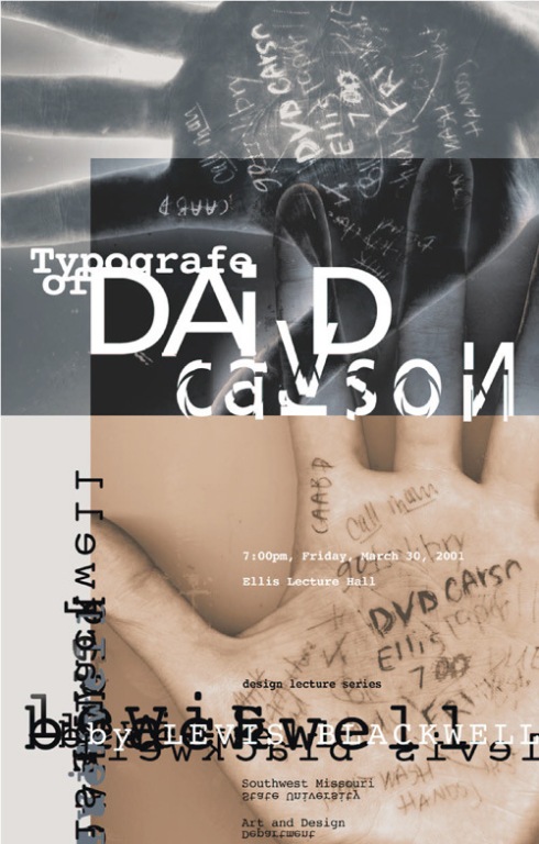
One of my favorite graphic designer is David Carson.  He is an American Graphic Designer, David Carson has worldwide fame and is probably the most influential Graphic Designer of the nineties. His introduction of imaginative ideas in magazine design together with his use of experimental typography has gained him fame globally. Carson used typography efficiently in his works. The following are some of his amazing works that I would like to share.

Image

Image

Image